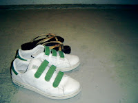
Execution: Pictures from my angle/ view through my eyes.
Plan of frames:
1) start of the day - reaching for alarm clock
2) wash up - brush teeth (mirror view)
3) make up/dress up
4) leave house
5) meet boyfriend
6) hug
7) shop
8) eat dinner
9) go home
10) good night
With this idea I went ahead to take my pictures with NM2208 experience in mind i.e. all in same same format, that is landscape then all should be landscape:


Was trying hard to perfect the respective frame. Then I realized it does not have the effect of "view through my eyes" because the key to is that human eyes are not fixed or bounded by a frame. The eyes can see a 180 degree view. Thus I went back to my sketch book at started thinking for new ideas.
Idea2: Focus on product/object, use object to communicate some kind of story, similar to advertisements especially when we are all exposed to so many advertisements every day. In addition, after taking a look at the link on good images and the instructions of having to keep the background of the image clean, I decided that objects would be of a good choice.
Execution: Use rule of thirds, different angles to portray story
Plan of frames: To take KEY objects:-
- clock/watch
-handphone
-toothbrush
-shower
-clothes
-footwear
-makeup
However, as I wanted to keep my theme of dating, I thought of creating 2 sides of the story. Then I realized the positioning of the frames in the template could help me out with the execution of my story when I went to download it and plan the sequence and placement of frames.
Here are the photos I took:

1st re-shot: too centralized

2nd re-shot with some effects


This shot was chosen instead because
of the angle. Nicer than bird eye view.


This was chosen because of the quality.


This was chosen because of the left
hand corner showing too much of
the wall. This picture was also
enhanced using iphoto.


This was chosen because of the clean
background and I enhanced it too so
that the colors are brighter and chirpy.


This was chosen because the image
is sharper.

Too big.

Not proportionate. Should have
more are for the cap.

Too much reflection on cap.

Just nice.

Position of watch too flat.

Shadow casted outside of frame.

Perfect.

Too dark. To upclose. May be be
able to tell they are tee shirt and
jeans.


Somehow... this one looks slightly nicer.

Too still.

Too upclose.

Just nice.
I were more lucky with the following shots. Did not have to try a million times before getting them right. Shan't bored you all with similar shots with minor difference:


And these shots were taken by me from the past:


 RSS Feed (xml)
No comments:
Post a Comment